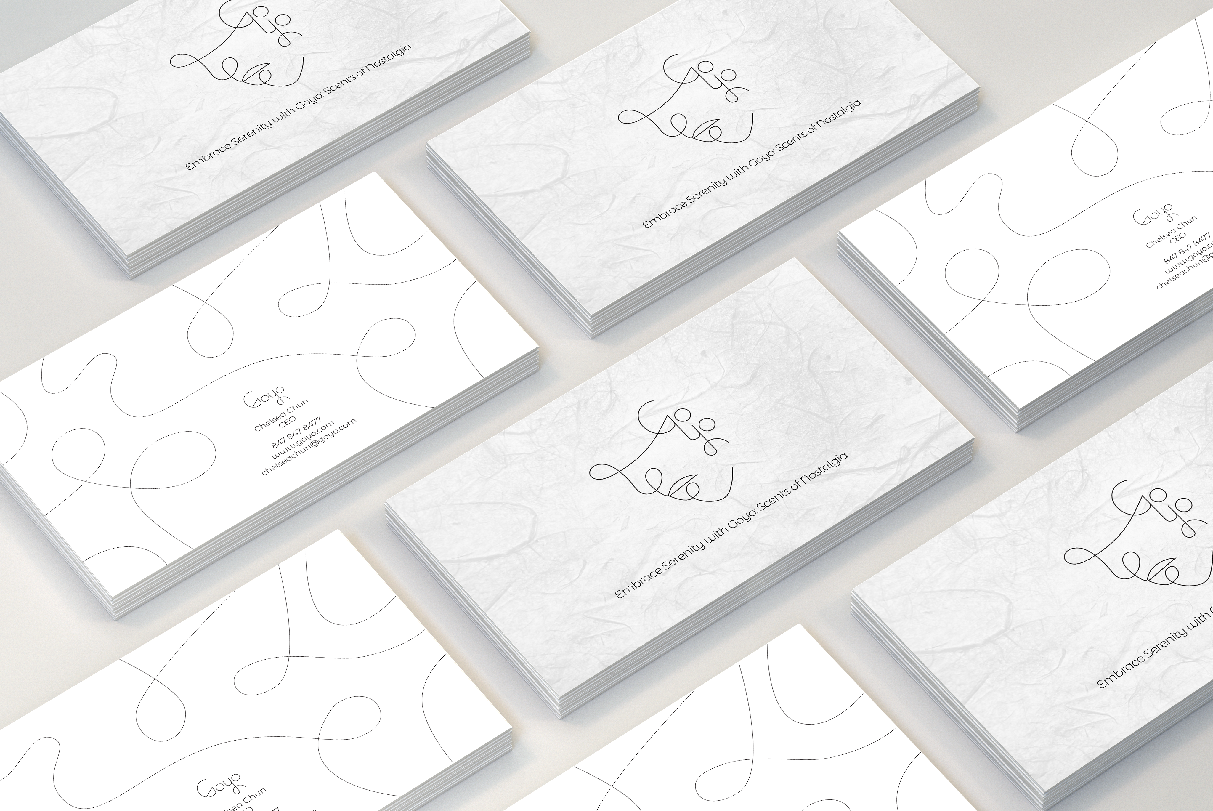
Goyo Product Packaging
Goyo
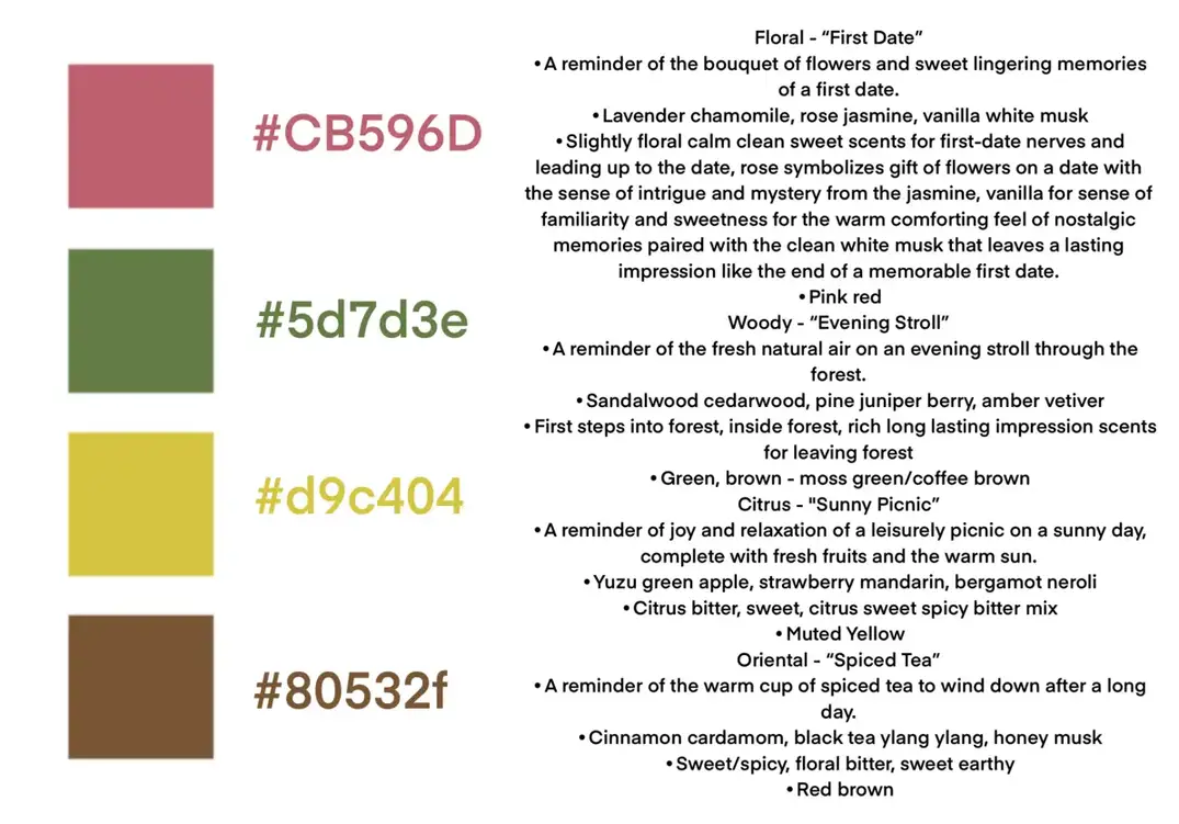
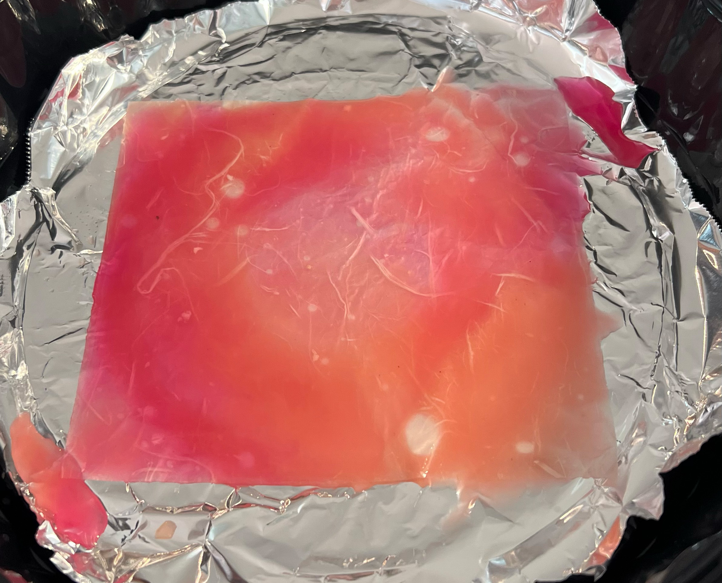
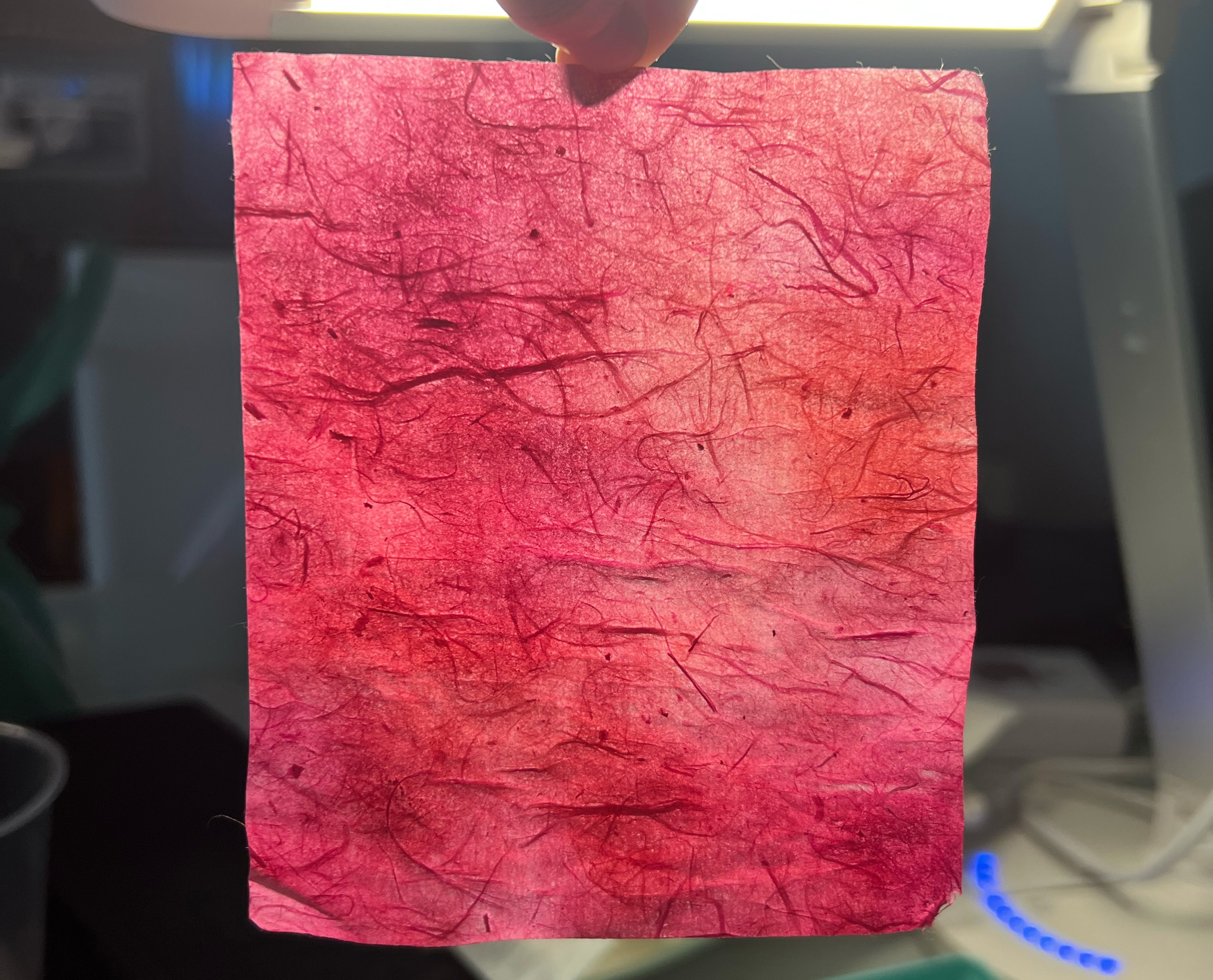
This project focuses on product packaging and visual identity to explore the depths of the perfume industry and the power fragrances hold in evoking nostalgic memories and creating relaxation. I was inspired by the gentle hues and fluid nature of watercolor painting and one-line drawings, which sparked my exploration of how nostalgic scents can relax the mind. I mixed fine art and digital design to create six distinctive package designs using Adobe Illustrator, Photoshop, and Lightroom.

Goyo is a perfume brand with a primary focus on creating scents that are crafted to soothe the mind and bring a sense of nostalgia.
Goyo Store Banner
Goyo Business Card
Logo Design
The logo is a translation of the Korean word ‘고요’ which means ‘calm’ in English. This abstract representation displays a thin, fluid line forming a face, which serves as a symbol of inner beauty and tranquility of mind.
Logo Design
Logo Sketches
Color Palette
This color palette is aimed to encapsulate a range of nostalgic memories. Emphasizing muted tones, the palette is designed to produce a serene and contemplative ambiance. This choice not only complements but also highlights the delicate texture of the Hanji paper, adding depth and character to the overall presentation. The subtle interplay between the colors and the paper's texture lends a timeless quality to the work, making it both personal and universally relatable.
Color Palette
Watercolor Process
This packaging design employs a unique watercolor technique to achieve a marble-like effect. The process involves blending various tones seamlessly while retaining the distinct softness characteristic of watercolor paintings. The intention behind this technique is to capture the organic flow of watercolor paints, allowing the colors to merge naturally. This approach results in a design that is both visually striking and evocative of the fluidity and spontaneity inherent in watercolor artistry.
Watercolor Process
Watercolor Process